|
|
Post by adamstabelli5 on Jul 10, 2010 16:34:32 GMT -5
|
|
|
|
Post by shea6408 on Jul 10, 2010 21:06:14 GMT -5
Looks interesting. I like the font used for the family names, and that they're using lower case as well ("Smith" instead of "SMITH").
|
|
|
|
Post by Rob on Jul 12, 2010 13:15:46 GMT -5
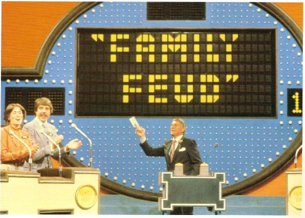
Great job adamstabelli5 on breaking the pic on this site. For those who would like to view a bigger, and slightly-clearer photo, twitpic.com/245k3u/fullI couldn't be happier that there's no more "audience in-the-round" set, and that there's a regular backdrop behind the big board. I'm not sure how I feel about the face-off podium...I think I'll wait to see it in action before I judge. The contestant podiums don't seem too bad...again, I'll wait to see people behind them before I judge. The white floor certainly is new & shiny. I do believe, if I see correctly, there is an oval-like block-pattern light coming from the floor (closer to the audience-end of the stage). I wonder what this might display (if I am seeing this correctly)? |
|
|
|
Post by michaljohn on Oct 8, 2010 4:38:39 GMT -5
This is so much better than the O’Hurley set! The last one looked way too crowded with the audience in the round and the audience right up against the stage. Can’t wait to see it in action!
|
|